I’ve made some great connections in the last few months with my PayGap.ie portal, and wanted to share some of what I’ve been doing.
I visited the Geary Institute of Public Policy to speak at one of their lunchtime seminars about the portal, and following this, they invited me to write a short paper for PublicPolicy.ie. That paper outlined the state of reporting so far, what I’ve learned, and suggested some policy improvements that could be made.
I visited Phoenix FM to talk to them about the portal, and also gave them a brief statement on the announcement of a government portal (at long last!)
There’s more coming, and I’m very grateful for the opportunities I’ve had to share my work with others so far!
In 2022, Irish companies with more than 250 employees published their first gender pay gap reports. While some companies were already voluntarily disclosing this information, legislation introduced in 2021 made the publication mandatory. It’s January 2024, and we’re two years in, let’s take a look at what this legislation has given us, and what it’s still failing to do.
A little background
Why am I talking about these gender pay gap reports, isn’t it good enough that the data is out there? Well, in 2022 I added a page on this site which showed the data I had gathered for companies reporting that year. At the end of 2023, I realised that the page wasn’t enough, and that I needed more space and flexibility, so I moved the data to its own site. All of the data gathering has been manual (more on that later), and that means that I have read almost every gender pay gap report published since 2022. All of this means that I am intimately familiar with the quality of the gender pay gap reports that have been published, and I’m unhappy to say that it absolutely is not good enough that the data is out there. Let’s talk about why.
Accessibility
The manual data gathering for the databases has been made much more difficult by the choices made by companies producing the reports. When the government published the legislation, they included specifics about what data should be included in the report, but absolutely no details on what format the report should take, how it should be laid out, etc. This has resulted in the reports themselves arriving in a mishmash of formats including everything from 13 page glossy PDFs with stock photos of happy working women, to single web pages that were overwritten with 2023’s data and Powerpoint files that you have download to access. This has made gathering the data difficult, as it all has to be manually read and gathered. With no standard format, there’s no way to automate the process of gathering the data, as there’s no guarantee you’d be scraping the right data.
Since all of the data gathering has been manual, this has given me a lot of time to think about how people are choosing to present the data, and consider the accessibility failures that they represent.
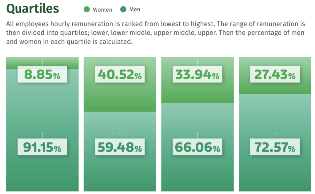
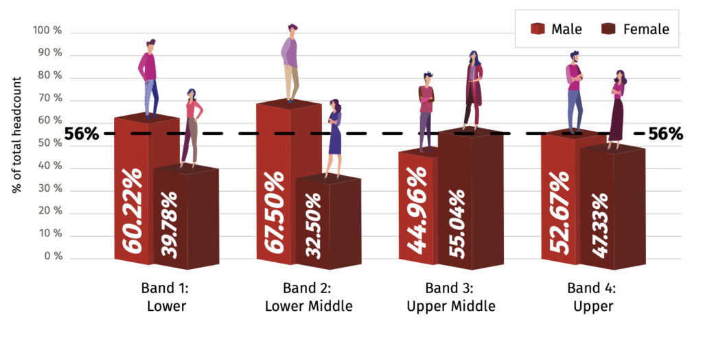
A quartile graph from Coillte’s 2022 report.
A headcount graph from Respond’s 2022 report.
Above is a quartile graph from Coillte’s 2022 gender pay gap report (a format which they repeated in 2023). It’s clear that many entities chose to use brand or theme colours for their reports, but like this example from Coillte, this is very much to the detriment of readability. This green on green graph is extremely unclear even to me, a reader without colourblindness. The legend appears to show the colour of the text in the boxes, not the bars of the graph. The bars in the graph are a gradient which partially matches the text colour, but not fully. And finally the legend itself is so small and far away from the text that it’s very difficult to compare the colours to the graph. This is a barely readable graph, and the information doesn’t appear anywhere else in text-only format, you have to interpret the two similar shades of green in order to read the data. Near-identical shades of green proved a popular theme in 2022, with Respond choosing that palette to display their overall headcount. Again, the colour blocks on the legend are extremely small, making it difficult to be certain which block is which.
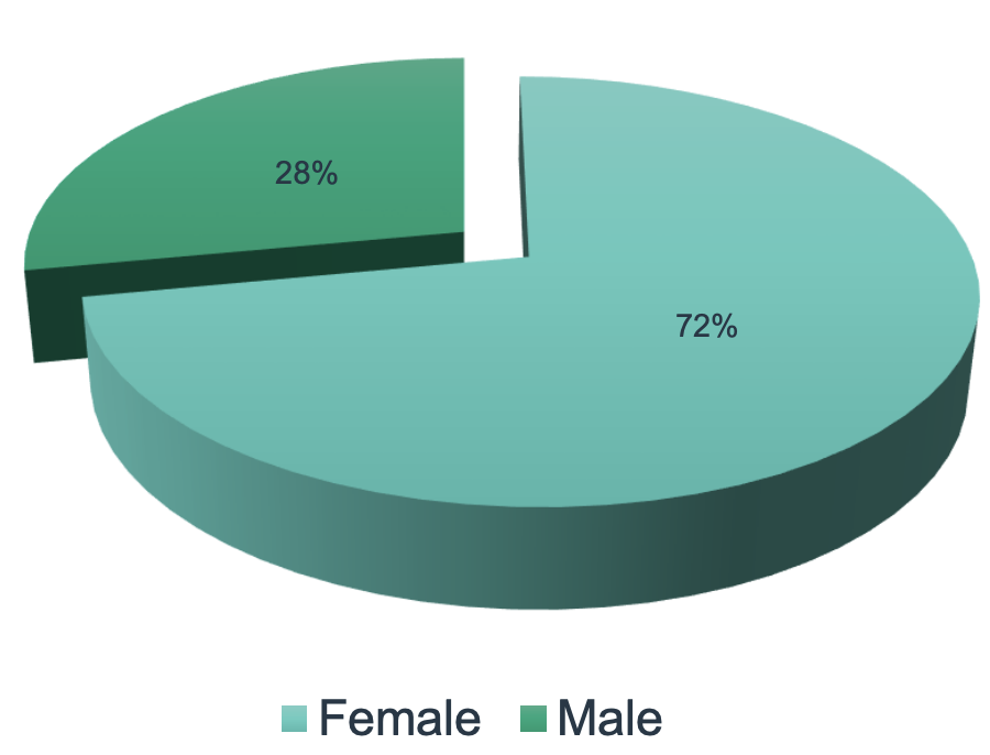
Cork City Council headcount
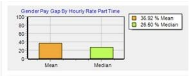
Royal Victoria Eye & Ear Part Time Mean & Median Gap
In 2023, Cork City Council chose shades of red and slightly browner red to display the overall proportions of male and female employees. Once again, there’s a repeat of the tiny legend blocks, with not enough colour to allow for a comparison. These colours would also be extremely difficult for people with some forms of colourblindness to read. As with so many other reports, the information is only represented in graph form, so if you can’t accurately interpret the graph, you can’t get the data.
The image on the right is from the Royal Victoria Eye & Ear Hospital’s 2022 report. I have not changed the size or quality of this upload, this is exactly how the image appears in the report. The blurry text in this heavily pixelated image is not reproduced elsewhere in the report in a table, or in explanatory text below the graph. You simply have to zoom in and do your best to read the figures. Is it a 6 or a 5? 26.50 or 25.60? Almost every graph in their report is included like this – obviously a screenshot from their reporting tool included without any consideration of the quality.
Quartiles from Kildare County Council’s report
In 2023’s report, Kildare County Council chose to represent their quartile data using shades of red and slightly-darker-red. Because the numbers are represented only by the sideways text on the bars, and the bars change size, the font also changes size for each number, and finally, in case you thought you could be certain about which bar represents male and female, the little figure on the top of each bar also changes for every single bar…
At the risk of making this an overly long post, I wanted to highlight just one more pair of graphs.
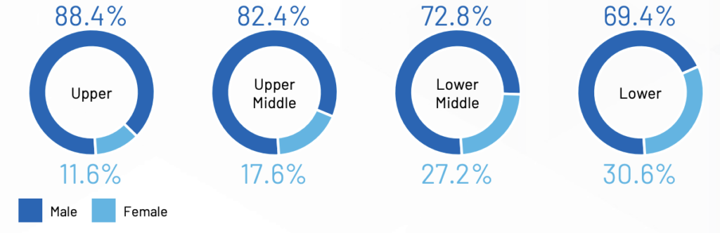
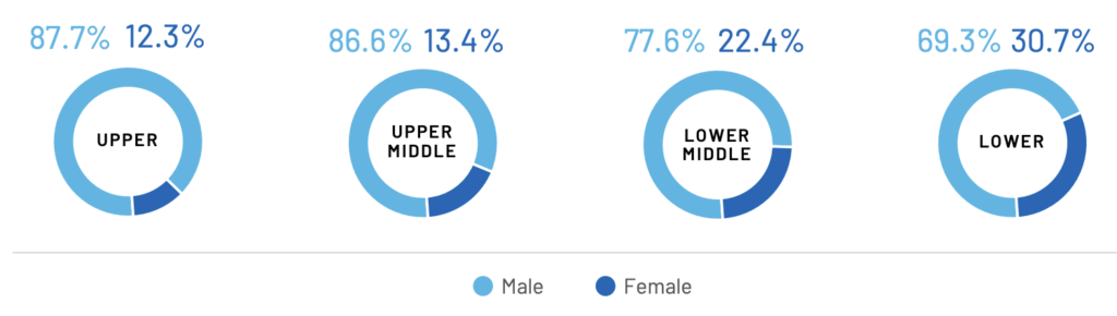
These are the quartile graphs for Analog Devices. On the left is the graph for 2022, and the right is 2023. At a quick glance, you would be forgiven for thinking that incredible progress had been made, and that the upper quartiles now contain far more women than men, but look again. The proportions haven’t changed much at all, but the colours have been flipped between the years, so that the colour which represented male in 2022 represents female in 2023. A charitable interpretation of this is that they are simply using brand colours, and whoever compiled the 2023 report didn’t see the 2022 version. A less charitable interpretation of this is obvious.
Truly, this section could go on for pages, it could be (and maybe soon will be) a gallery of data visualisation sins spanning many more reports. The selection I’ve shared above are not the only offenders, merely some of those I noted while reviewing reports. And while it’s been simply frustrating for me to get the data from these graphs, anyone using a screen reader, anyone with a form of colourblindness, etc. would likely struggle to interpret any data from many of these reports. These reports don’t meet basic accessibility standards, making them useless for many people.
Oversight is an oversight
If you’re thinking that surely someone, somewhere, must be overseeing these reports, and wondering why they haven’t asked the companies to do a better job, you are going to be disappointed. With no government provided central portal for all the reports, there is also absolutely no oversight of the reports. No government body has been appointed or designated as the people who should oversee the reports and make sure they are readable and contain all the information that they are supposed to. The result of this is clear to anyone who reads more than a few of the resulting reports.
Since the beginning of reporting, companies have been publishing reports that do not meet accessibility standards, that do not include all of the data they should, or that include data that has been incorrectly calculated or reported. The Brothers of Charity reported their figures in Euro rather than percentages (which is the specified reporting method) in both 2022 and 2023. Several companies (Actavo, Ardmac, Depaul, Dublin Bus, to name just a few) did not report their quartiles correctly, some didn’t include part or all of the data (Mazars, Standard Life).
The legislation says that the reports must be accessible for three years, but when I undertook a review of my 2022 dataset, the number of broken links was substantial. Some companies moved the files and it was easy to find them again, but other companies have simply overwritten last year’s webpage, obliterating their 2022 data.
Lastly, as I write this it is the 24th of January. Given that companies must choose a date in June and then have 6 months from that date to report, every single company report was due on or before December 31st. As you can see from the “missing” page on my portal, that has not happened. Allowing for the fact that some companies may have published in the few days since I last checked, or that I may be missing the link to one or two of these companies, it is fair to say that the majority (if not all) of the companies on the list are late with their report. And this is exactly what happened in 2022 also – companies were publishing reports well into the first quarter of the year, with absolutely no sanctions. I expect to still be gathering 2023 data well into March or April of this year.
Failure to centralise
Gender pay gap reporting has been included in UK legislation for several years, and there is a central portal available for the reports. Companies submit their data there, and this is a database that anyone can search. While the Irish government promised a similar central portal, they have now said they have no timeline for this will be available. This is perhaps the biggest and most disappointing failure of all with respect to this legislation, as the lack of a portal fundamentally undermines the point of publishing the data in the first place.
Having data on the pay gaps in Irish companies is so useful, but only if people can actually use the data. In its current form, it is effectively unusable. People who want to compare the data from one year to the next are left with no choice but to build their own database and perform their own calculations. With reports that go missing each year, that have different formats, and omitted data, you’ve got to build up some sort of spreadsheet yourself to even view the change over time. The same is true for people who wish to compare companies across certain industries, for example. And for those who don’t want to become citizen data scientists simply to understand where their own employer stands, where do they go?
With no central portal, no standard format, and no oversight about the correctness of the reports, the companies might as well be printing them out and then throwing them straight in the recycling bin.
Wrapping it all up
It will come as no surprise to anyone who’s read this blog, or spoken to me in person, that I believe that sunlight is the best disinfectant – i.e. the best way to promote change is to show the current state of play in black and white. Viewing the pay gaps and quartiles for companies makes it abundantly clear that there is still a long way to go in terms of female representation in certain industries, and in higher paying jobs in many industries. Companies often invest a lot in PR about how they do so much for their female employees, but the figures don’t lie, and that’s why it is so important to have this data accessible to everyone.
While I am proud of the work I’ve done with my gender pay gap portal, my ultimate desire is that this be a redundant project. It shouldn’t be up to me or any other individual citizen to deliver on a promise made by our government, to hold companies accountable for the deadlines they miss, and to remind them of their legislative obligations. As time passes, the number of companies included in the mandatory reporting will increase and this will become unsustainable for me, as one individual, to maintain.
The original legislation has gotten us halfway there, it’s not good enough for the government to simply drop the ball now. They need to bring this across the finish line, and deliver an effective portal that everyone can use, that can act as a long term historical repository, and that actually makes this publishing worthwhile.
If you’ve been on my site before, chances are you’ve seen the link in the menu to the 2022 gender pay gap database. When I set up this page on my website last year, I had to work around a number of tricky limitations and ended up having to insert custom code into WordPress to display the data the way I wanted to. There wasn’t a plugin (or three) that I could use to load the data from a database and allow for it to be searched, updated, etc. easily.
I found some ways to make it work for the first year, but then the government announced that they would not actually have a portal for 2023 either, and that they didn’t have a clear date for when there would be a portal available. I started to try and expand my existing setup, and ran into many of the same issues as last year, compounded by the fact that I was trying to manage and display two different sets of data. I kept running into the fact that it would just be better to build something more custom. Over the last week or so I’ve spent time doing just that. It’s all the same data, displayed as it was before in searchable sortable tables, but with a number of improvements.
The new site has the full 2022 database, and I’m building the 2023 database at the moment. There’s also a form where you can submit reports with their info directly, to help me build 2023’s dataset more quickly (and any future datasets too).
This new sub-site will let me keep expanding the dataset, and hopefully expand to include some visualisations of data, comparisons, etc.
If you appreciate what I’m doing here and want to help, one of the best ways you can do so is to use the form on the new site and submit links to any company’s gender pay gap report, and ideally pull out the headline figures for me.
Watch this space for updates as the 2023 database grows!
International Women’s Day is upon us once again! It seems like only yesterday that I was setting up this blog to discuss some of my experiences as a woman in tech, but here we are again.
I thought I’d take a moment this year to instead recognise some of the winners and losers of International Women’s Day this year, and yes, there are very definitely winners and losers. The day wasn’t always about the marketing opportunity – it’s supposed to be about celebrating the achievements of women, about celebrating the social, political, cultural, global impact that women have, about recognising the barriers that women face and what we can do to dismantle them, etc. Over time, however, the day has become heavily commercialised, and is now treated largely as an opportunity by many companies to post a slogan or a hashtag without any real effort to shift the conditions for the women who work for their companies.
Gold Star Winner
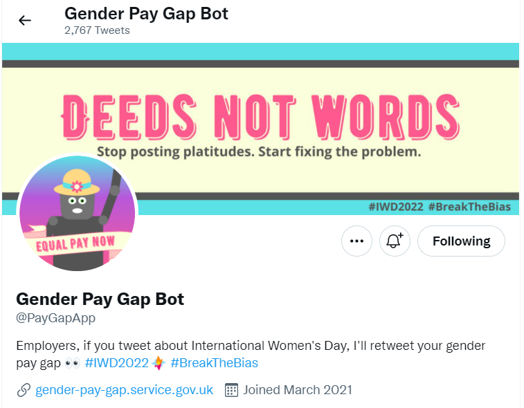
The undeniable Winner of IWD 2022 is the Twitter Gender Pay Gap Bot. This clever little bot, created by Francesa Lawson and Ali Fensome, uses data sourced from the UK Govt’s database on gender pay gap, which all companies with more than 250 employees are obliged to submit data to. When those companies tweeted using the IWD hashtag, the bot retweeted their tweets quoting the median hourly pay gap percentage. Watching the posts roll in all day was a delightful source of merry chaos, and an occasional source of delight when you see some companies which had genuine pay equality!
Many companies, upon seeing themselves retweeted by the bot, chose the scorched earth policy of blocking the bot or deleting their message and retweeting it without the associated hashtag. This, predictably, didn’t work, and usually just served to draw more attention to their particular case. A related honourable mention must, therefore, go to Madeline Odent and her wonderful curated thread of all the companies who deleted/blocked/modified their posts in an attempt to evade the bot, thereby ultimately making an even bigger mess for themselves. I salute you for your hours of tireless work Madeline!
Honorable Mention (Silver Boot)
The Welsh Rugby Union used IWD to announce a suite of new initiatives such as providing free menstrual products, pelvic floor training, a partnership with a menstruation underwear brand, not to mention highlighting their awarding of full time professional contracts (in case you missed it at the start of the year).
Jen, why are you talking about Wales Rugby, you might ask? Well, it’s just that some other rugby teams have been getting it fairly spectacularly wrong lately. Like the IRFU with regard to our own women’s rugby team just last week. And this year’s Golden Facepalm Winner……
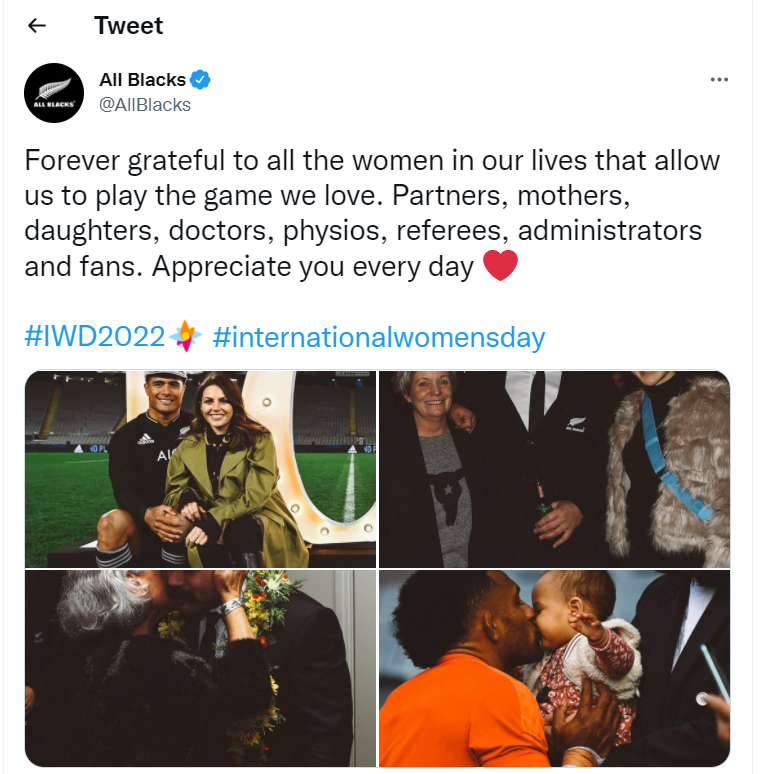
Golden Facepalm – The All Blacks
In a world where the Black Ferns exist, and they have won five of the past six Women’s Rugby World Cup’s, where you had the option to retweet the message they shared for IWD and extend the reach of their twitter account with a simple “we support you” or “we support this” note, or even a black heart emoji, or just a plain retweet without comment, the All Blacks chose to post this instead.
This.
It’s actually still up there as of writing, on March 9th, despite almost an universally negative response. Why so negative? Let me count the ways.
This message is centred in the perspective of what women do for men, rather than what they may do for themselves, or how they may exist for themselves. It has the same structure, and same failing, as the “she’s someone’s wife/mother/daughter” trope. She is someone all by herself, not merely in relation to the service she can provide to a man or the relation she is to a man. It casts women as the enablers or in support roles to men, and on International Women’s Day, it’s just not the day. “Congrats women for being so good at supporting the men in being brilliant” is a message that wouldn’t be great on most days really but for it to be your key marketing message on International Women’s Day is a spectacularly poor choice.
“Allow” is also a poor choice of word here because it does have echoes of the “allowed out to play” attitude that we see reflected so often in mainstream media too, which is infantilising for men and insulting for women, so it’s doubly awful. While I understand that sometimes word choice in a tweet is also dictated by space, and I’d usually grant that this may have been a space related choice, I did check and you could have replaced the word “allow” with the whole phrase “support us in playing” and it would still have been under the word count so 🙅♀️.
Lastly, I’ll mention the same thing which has been said in response to the tweet online, which is that the particular players chosen in some of these images are poor role models at the best of times, and especially poor role models for a day which is meant to honour and respect women. Players who have had domestic violence charges laid against them should not appear as part of promotional content for International Women’s Day twitter posts and that feels like such a basic rule that it is unbelievable that I should even have to type it, akin to “you should put on a coat if it is raining outside” or “look both ways before crossing the street”.
They have weakly apologised for “not getting it right”, but not on the All Blacks twitter account, where the majority of their twitter followers actually are and where that post still remains(?!), but on their @NZRugby account, where they *checks notes* almost never tweet from (1217 tweets total at time of writing), and which has even fewer followers than the Black Ferns account which they still have chosen not to try and promote from the All Blacks account, so I guess some people might call that a little… insincere?
1 Million Followers 15.8K Followers13K Followers
Silver (?) Facepalm
I’ve chosen to give this a Silver Facepalm because, like international brands everywhere considering their promotional material for IWD, I take the sanctity of these awards very seriously, and I couldn’t have two Gold Facepalms on the inaugural year of the awards as I felt it would make a mockery of the whole system. In iVisit London’s defence, I suppose they were just reposting copy given to them by the London Dungeon, so it’s really a shared award by both of them, so it’s a double Silver Facepalm.
Again, in the category of “sentences and rules I didn’t think I’d be needing to clarify”, making a funny fun time joke about a notorious murderer of women and calling her Jackie *wowsparkle* is very much not quality copy for a day that is supposed to be about celebrating women. Maybe don’t try to yassify murderers for International Women’s Day? Maybe that’s not the vibe? Maybe if all today is to you is an opportunity to tweet some twee nonsense with a hashtag then you should just step away from your “murderous females” pinterest board and, just, take a personal day.
And, I guess, it almost feels twee to say it myself but go with me here – you couldn’t have even on this, the day of international women, found a single female figure to advertise the London Dungeon? Leaving aside the fact that I think it is grotesque to use murder as a cutesy way to advertise yourself, even on this day you felt that the single well known male serial killer needed to be front and centre in your ad copy? Zero stars.
The post has since been deleted and iVisit London have said they just shared ad copy from the London Dungeon and they shouldn’t have, it wasn’t up to their standards, etc. A fairly bland, standard apology. The London Dungeon said they wanted to give an opportunity to show a theory that Jack the Ripper could have been female but given that they’re replacing their usual actor for “one day and one day only” but this one day could have been any day, and there’s no reason for it to be one day only. A terrible marketing misstep on a day that should be about anything but marketing.
What did you see yesterday?
That’s what I saw in my corner of the internet yesterday. Did you see a particularly well thought out initiative that you’d like to share? Or a particularly egregious flop? I’d love to hear about it.
The Citizens’ Assembly has today voted for a program of reforms on gender equality in Ireland, including some recommendations around extending gender quotas, and ahead of the predictable backlash for gender quotas, I want to share some thoughts on the inevitable “best person for the job” rhetoric.
A frequent refrain when people mention gender quotas is that it should just be “the best person for the job”, and that gender shouldn’t matter, but the people who make this argument rarely pause to consider or explore the sexist ideal they prop up with this statement. Let’s dig into that now.
Studies have shown that when people are blinded to gender, the choices they make represent the actual spectrum of gender much more accurately. We see it in jobs, we see it in award nominations, we see it in all aspects of life. Which means that something different is happening when panels aren’t blinded. We’ve seen that panels are affected by unconscious bias, and end up hiring those who look like them, sound like them, etc. And we’ve seen that people who don’t fit the already established “mold” get left out of this process – even before we step into the interview, we have seen that biased algorithms filter out CVs of women and people of colour, and job descriptions discourage applications from underrepresented groups. We face an uphill battle to improve gender equality in hiring.
Why not just more unconscious bias training?
So why quotas? Why not just more training? Can’t we just trust that people will address their unconscious biases, or wait until we reach a more balanced representation organically?
No. We can’t.
Unconscious bias training remains a controversial topic. When people propose unconscious bias training, it is often met with resistance and mockery, and people questioning whether the training leads to real change. There have been some studies to examine the effect of unconscious bias training and right now, the evidence suggests that while the training does raise awareness of these biases, the overall effect is not translating into significant behavioural changes. It is worthwhile, but it is not enough.
And so here we are, with mandated gender quotas. Why? Frankly, because for years, you were asked nicely and you ignored it. Many of the studies which show gender bias in hiring are decades old, this is not a new problem, and people have been raising it for a very very long time. Maybe you were given training about why diverse hiring matters, about unconscious bias, and you ignored it or didn’t internalise it enough to action it. Maybe you’ve never examined your job descriptions to see why all of your candidates look the same. So now your hand has to be forced with quotas, because you won’t do it voluntarily, and people should not have to wait ten more lifetimes for you to decide it suits you to make a change.
But don’t you think it should be the best person?
If we loop back to our original thesis, that it should always be just “the best person for the job” regardless of gender, I actually agree. It should be the “best” person. But the unspoken part of this is that you are saying that this is currently how things are actually done, that this idea of “best person regardless” is the current status quo. And there, I must firmly disagree.
When you say “the best person” and imply that that’s what is happening right now, you’re propping up a myth, a status quo that isn’t. The status quo isn’t always hiring the best person, it’s hiring the one you like, and very often, the one you like is the one you match. And when the hiring panel is predominantly old white men, guess who matches them?
Your status quo is a myth
When you say “best person for the job” this is the unasked question which shows the problem with your statement: If we currently hire “the best person regardless of gender” then why are all of those best people white men? For decades? Really, not a single other person was better? Honestly? If, at the moment, the best person already always got the job, then why is there still such a lack of diversity in hiring? What is the reason?
If we currently hire “the best person regardless of gender” then why are all of those best people white men?
Please, honestly, examine this thing that you are implicitly saying. If you think that right now, we always hire the best person regardless of gender, then you are also saying that the current gender representation everywhere is an accurate reflection of skill and qualification. You are saying the the only bias which exists is one which would cause someone to hire an incompetent woman over a man because “diversity” when a literal embarrassment of riches of evidence shows the very opposite. And if you don’t understand why such a statement might cause me to raise my eyebrows, well you’ve got rather a lot of catching up to do.
Can we completely eliminate bias from hiring? Maybe not. And maybe not soon. But gender quotas can force us to shine a light on how we currently hire, and make people think outside their current status quo.
The research
People with typically African-American names on their CVs do not get as many callbacks as people with “white” names: nber.org/papers/w9873
Multiple studies have shown that the way you look matters tremendously when it comes to hiring, with conventionally “attractive” people doing better. This study shows a bias against people with any facial disfigurement: https://news.rice.edu/2011/11/09/looks-do-matter-2/